The problem: A lack of time. And a website that nobody seemed to notice looked bad.
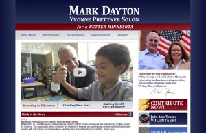
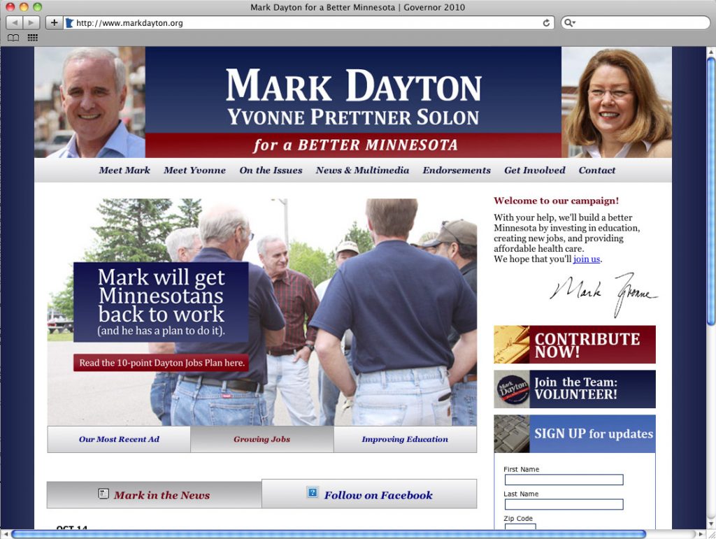
When Mark Dayton won the Democratic primary for governor in August 2010, the campaign’s website looked like this:
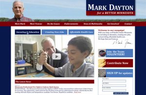
With limited time and few resources I did a graphic redesign of the site within a couple weeks. I was not going to be able to realized some new vision of interactivity (and political website standards were still unsophisticated), so most of the work involved cleaning up the clutter of the previous site, providing better focus, as well as creating the “ads” that rotated in the central window.
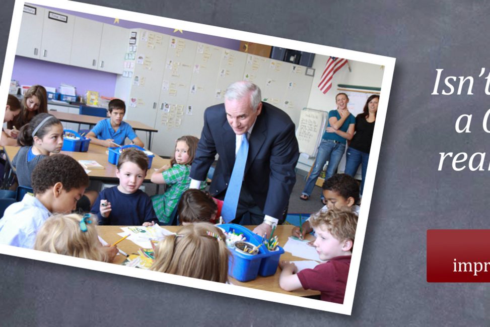
Here are the three rotating “hero ads”:


Result: Since Dayton won by only 1/2 of 1%, I like to think I had a real hand in securing this victory.
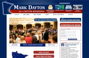
These were unused front page designs that I particularly liked: